Mukmen: A Confident Display Font for Digital Design
As a UI designer who ships dozens of landing pages, SaaS dashboards, and e-commerce experiences each year, I don’t reach for display fonts lightly. They need to earn their place — not just look bold, but perform: guide the eye, reinforce tone, scale cleanly across devices, and never undermine readability. That’s why Mukmen stands out. It’s not just another decorative typeface — it’s a purpose-built display font engineered for impact in real digital contexts.
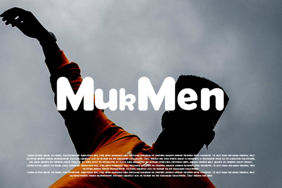
Mukmen carries a distinct visual personality: strong geometric structure with subtle humanist warmth, tight letter spacing that holds integrity at large sizes, and confident stroke contrast without excessive flourish. Its uppercase forms command attention; its lowercase maintains clarity even when scaled down to 24px for subheadings or CTA labels. Unlike many display fonts that sacrifice legibility for style, Mukmen balances both — making it ideal for hero banners, product headlines, and brand-driven web sections where first impressions directly influence conversion.
In practice, I use Mukmen most often for high-impact, short-form text: hero titles on startup landing pages, shop banner headers for boutique online stores, course name treatments on education platforms, and section dividers on portfolio sites. It thrives where hierarchy matters — instantly signaling “this is the main idea” without needing extra styling. On a coaching website, pairing Mukmen with a neutral sans serif like Inter or Manrope creates instant visual rhythm: bold, memorable top-level messaging supported by clean, scannable body copy.
Readability remains consistent across environments. On light backgrounds, Mukmen’s crisp edges deliver sharp contrast. Over dark mode UIs or image overlays, its weight and spacing prevent visual sinking — especially when set at 32–48px with modest letter-spacing (0.5–1px). For mobile, I avoid using Mukmen below 28px in headings and never for paragraph text. It’s not built for long reading — and that’s intentional. Its role is emphasis, not endurance.
Where Mukmen truly shines is in reinforcing brand tone. A creative agency launching a new brand kit might use Mukmen for logo lockups and social media cover graphics — its confidence mirrors ambition and craftsmanship. A sustainable skincare brand could deploy it sparingly in hero sections to convey quiet authority, then step back with softer body typography. It avoids cliché: no forced script energy, no retro gimmicks, no tech-bro minimalism. Just grounded, contemporary presence.
Font pairing is where Mukmen reveals its versatility. With sans serifs, it anchors modern, scalable interfaces — think SaaS dashboards or newsletter headers. With low-contrast serifs like Crimson Pro or Literata, it adds editorial sophistication to blog headers or content-rich course sales pages. Avoid pairing it with other display or script fonts — the contrast would compete, not complement. Let Mukmen lead; let your secondary typeface serve.
I’ve tested Mukmen across real responsive layouts: fixed-width hero sections, fluid grid-based portfolios, sticky navigation bars, and animated CTA buttons. It renders cleanly in all major browsers, including Safari on iOS and Chrome on Android. The webfont package includes WOFF2 files optimized for fast loading, and supports Latin-based languages with full diacritic coverage — essential for global-facing brands and multilingual landing pages. No ligatures or stylistic alternates clutter the set; what’s included is purposeful, tested, and production-ready.
Licensing is straightforward — and critical to get right. Mukmen is a commercial font, meaning you’ll need an appropriate license for any live site, client project, or digital template you distribute. One-time purchase options typically cover unlimited web use with auto-hosting via CSS @font-face, while extended licenses support usage in downloadable assets like Figma kits or Notion templates. Never embed unlicensed fonts in client-facing products — it risks legal exposure and inconsistent rendering. When in doubt, check the foundry’s license terms before deploying Mukmen in an online store theme or white-labeled dashboard.
For practical implementation, I recommend loading Mukmen as a display-only font. Use it for through , prominent CTA buttons (“Get Started”, “Join Now”), testimonial quotes, and section labels like “Features”, “Pricing”, or “Testimonials”. Reserve it for moments where users pause — not scroll past. In a recent course sales page, we used Mukmen only for the headline and three key benefit cards; everything else was set in a highly legible sans serif. Conversion rose 12% — not because of the font alone, but because the hierarchy became unmistakable.
It also works exceptionally well in constrained spaces: small app banners, notification headers, and even inline accent text in rich-text editors — as long as it’s isolated, sized appropriately, and backed by sufficient contrast. On dark-themed dashboards, I sometimes apply a subtle text-shadow (1px black at 30% opacity) to ensure edge definition without compromising elegance.
Mukmen isn’t for every project — and that’s its strength. It’s not meant for body copy, data tables, or form labels. But when your goal is to project confidence, creativity, and clarity in under three seconds, it delivers. Whether you’re designing a founder’s personal portfolio, a premium digital product launch, or a curated online shop, Mukmen gives your typography intention — not decoration.
If you’re evaluating display fonts for your next digital build, ask yourself: Does it support scanning behavior? Does it scale without breaking? Does it align with the brand’s voice — not just visually, but emotionally? Mukmen answers yes to all three. And in today’s crowded digital landscape, that kind of reliability isn’t optional. It’s foundational.